Print-on-Print Fun Winter Look
Happy Valentine’s Week and mid February! Even though this Holiday is definitely over-commercialized in the US, I still enjoy all the pink hearts and romance it conjures up. I think it’s also just a great excuse to treat yourself – as self-love is definitely something to celebrate. Take yourself out for a nice lunch (with or a without a glass of bubbly) – a latte + book at your favorite coffee shop, or a shopping at your favorite store. I plan on spending the day with my little Valentine – and have some fun stuff planned for us to enjoy during the afternoon – to be joined later by my hubby when he gets out of work.
Valentine’s Day is also an opportunity to add even more feminine details to your look – like shades of pink and red or heart and floral prints, to name a few.
Speaking of florals – I think it’s one of the most universally-liked prints, with a great variety of color and size options out there. It’s a great print to own in your wardrobe as it’s not super occasion-specific, is very versatile, and always brings a bit of freshness and femininity to your look – even in the darker and more contrasty color combinations.
In today’s outfit formula, I wanted to share some styling suggestions and general guidelines on how to choose florals that work best & what to consider when selecting them, as well as some tips on how to mix different florals (and prints in general) together in your outfits. Read along!
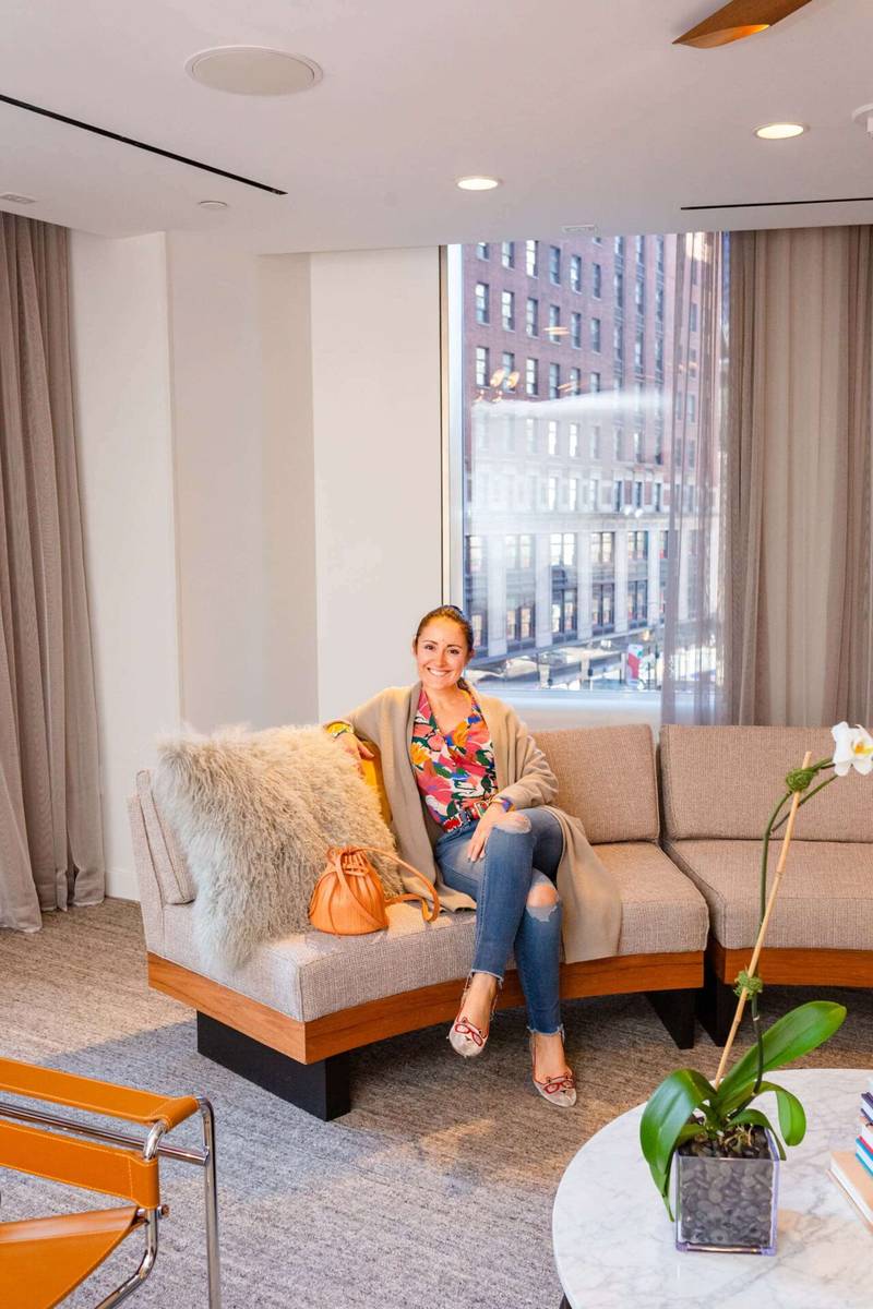
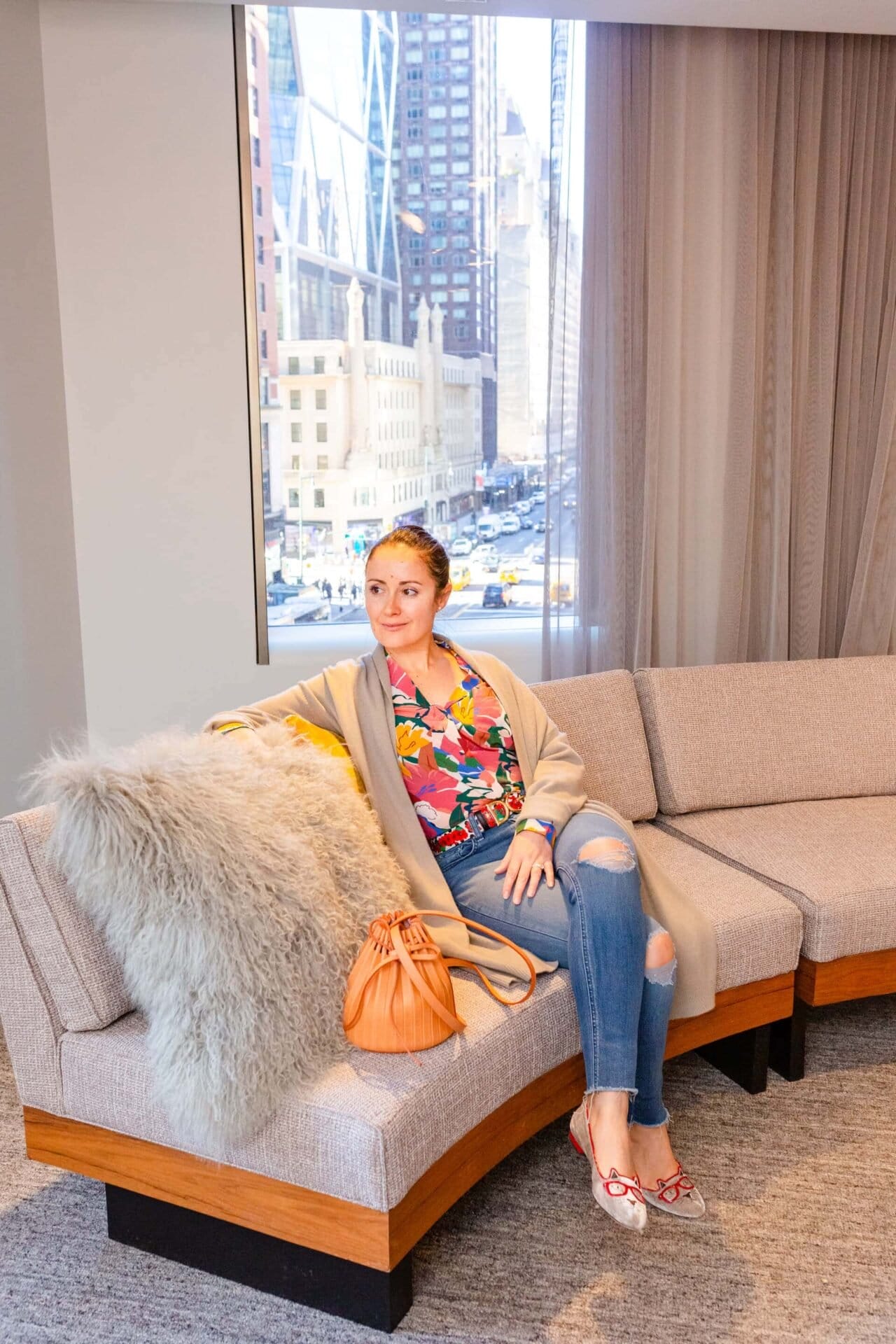
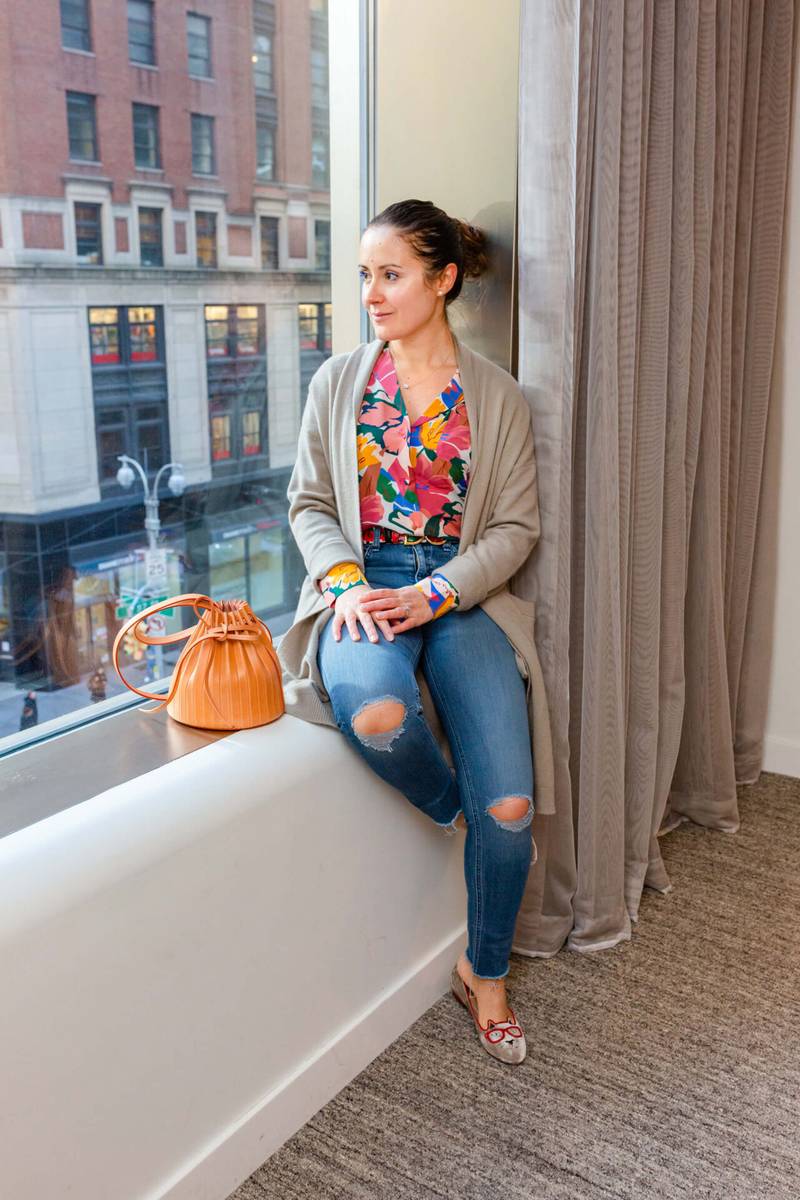
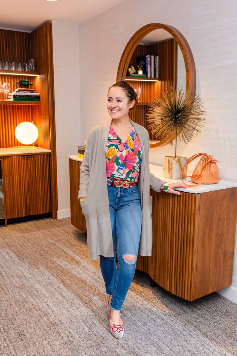
The exact ingredients of this outfit formula are:
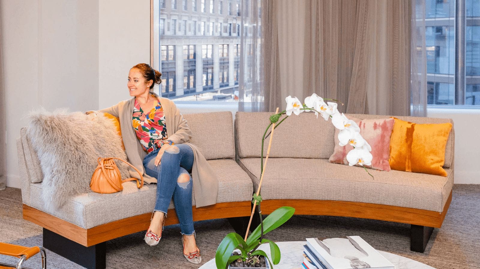
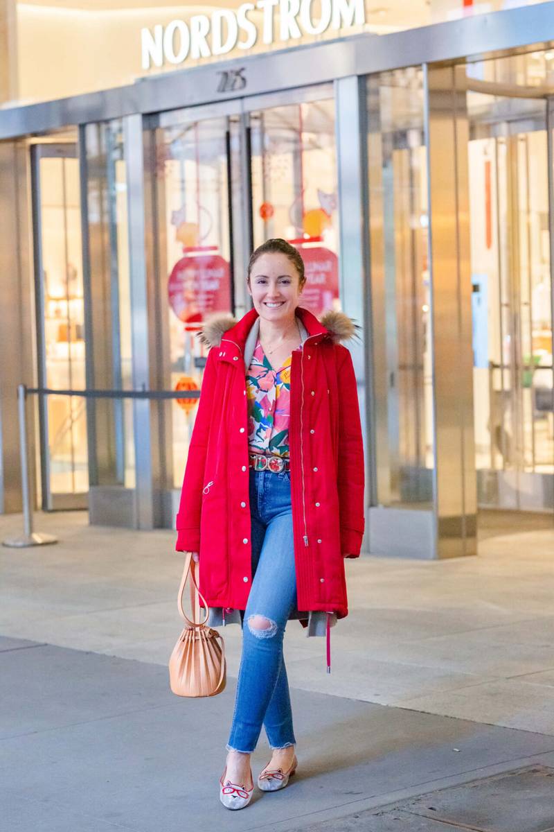
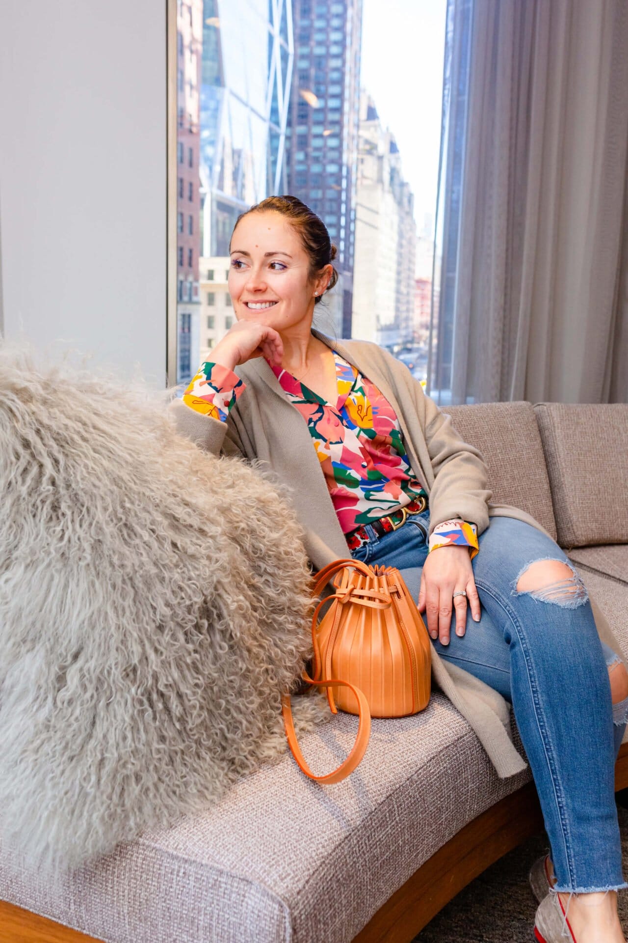
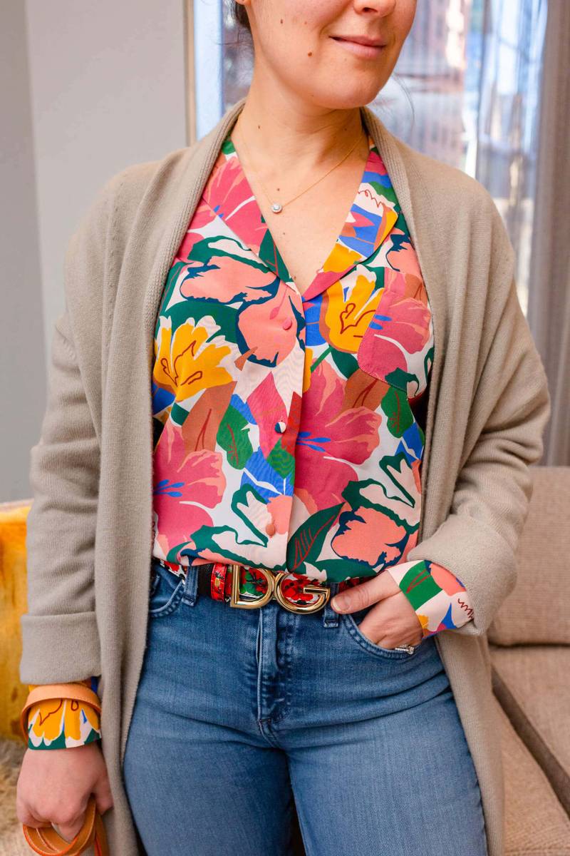
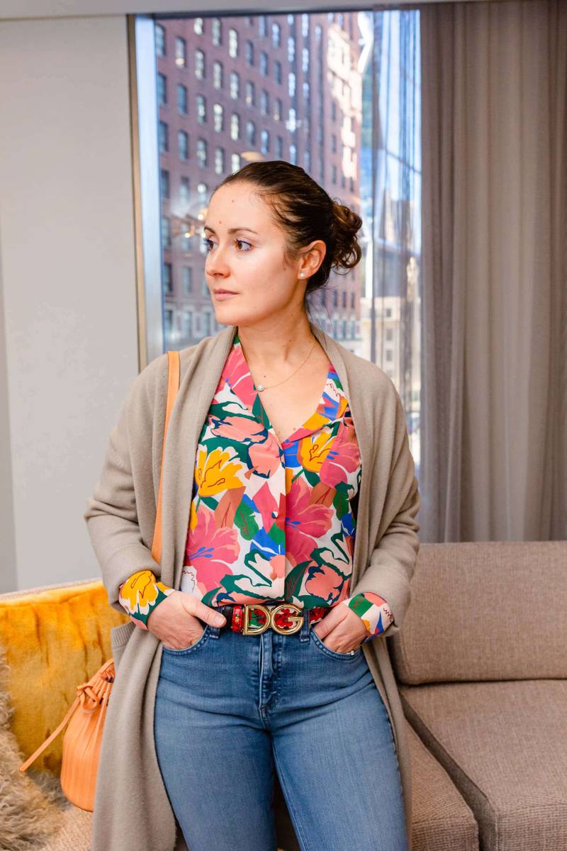
- The Floral Blouse. This beautifully silky Florence top is from Sezane and is in a gorgeous newish print called “Naives Flowers Print”. I love the color palette – as it’s bright and cheerful, yet sophisticated. The print also lends itself well to different face shapes and facial features – as one of the best ways to evaluate whether a print works for you is to see if the scale (size of it) closely resembles your facial features (e.g. if your facial features are on the larger side, a bigger floral pattern will look great; if you have smaller features, smaller flowers will work best). The reason why this one is pretty generally-fitting is because it combines a variety of floral sizes and has a slightly abstract look to it – which blends the floral lines together, appearing more artistic and less concrete.
- The Belt. In this outfit, I wore a Reversible Portofino-Print Dauphine Calfskin Dolce & Gabbana Floral Belt that I recently purchased from Moda Operandi (and revealed on my instagram a few months back) to coordinate with the floral blouse. The floral design of the belt is not entirely related to the floral print on the blouse, but there are a few things that tie them together. This is my usual guideline to making prints work in tandem in your outfit – finding at least one thing that’s similar or in-common; in this case, it’s the color palette, via color repetition. The belt is mostly red, with black and some specs of white and green, and the floral colors and outlines on the blouse pattern connect to and mimic those elements on the belt. The scale of the florals is also not competitive between the two pieces, and because they are not the same florals, they don’t blend in but don’t contrast too much. When wearing two related prints, I like either keeping them really close like in this case, or truly breaking them up – for example, if pairing a printed blouse with printed pants, I would include a belt or a color block to separate them and allow them both to show up.
- A Pair of Skinny Distressed Jeans. This pair is by Rag & Bone, and I love their darker wash and distress on the leg and around the ankle. I think pairing distressed jeans with a more feminine blouse nicely grounds the look and gives it dimension.
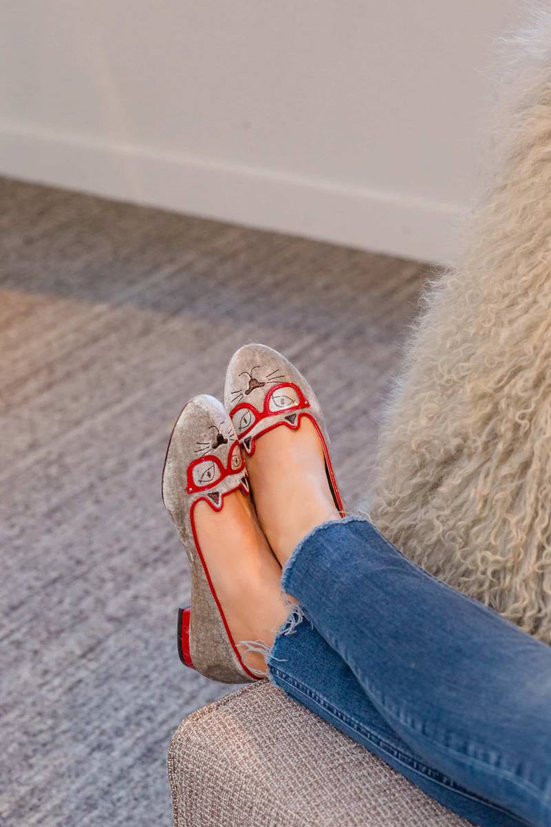
- A Pair of Cute Flats. Another element that allows this outfit to work is the color detail on the shoes — the red patent leather trim ties them together to the belt and the blouse, almost acting like a continuation of the print. This follows the concept of “linking”, which generally is the best “style secret” to making things come together without clashing – choosing similar elements in accessories, clothes and details that “link” or repeat each other – to look more polished and purposeful. These Charlotte Olympia Kitty Flats are one of my favorites! I’ve featured them in another look here.
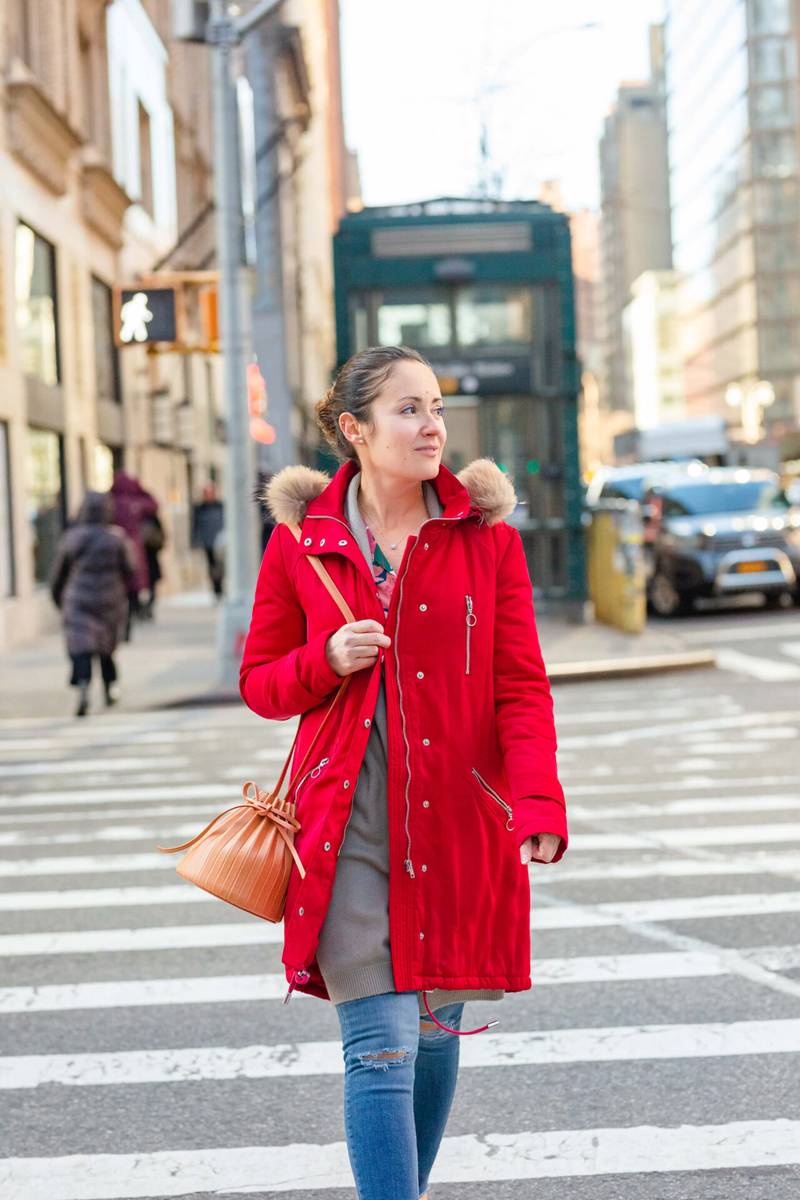
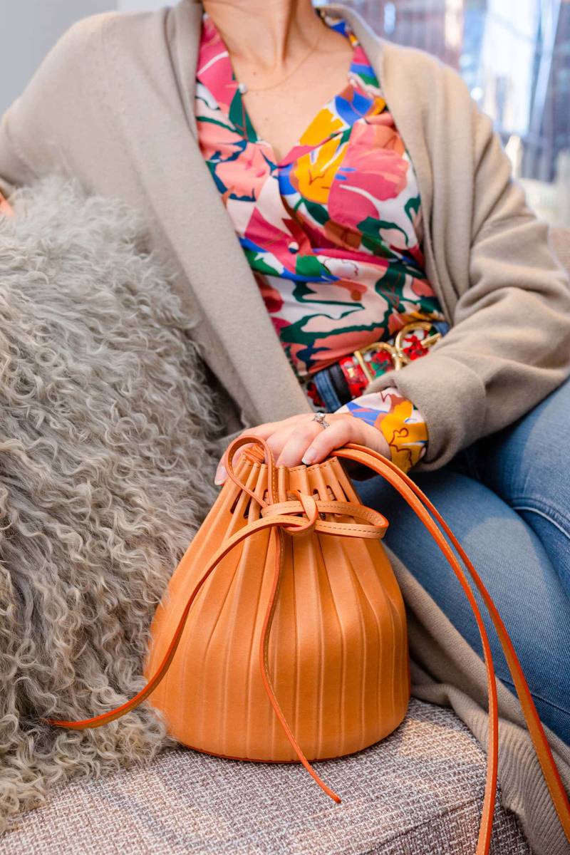
- A Neutral Yet Detailed Bag. This Mansur Gavriel Mini Pleated Leather Bucket Bag is one of my favorite designs from the brand. I love the shape, the way the pleats are such an unexpected element when it comes to leather, and how polished and fresh it looks while remaining classic.
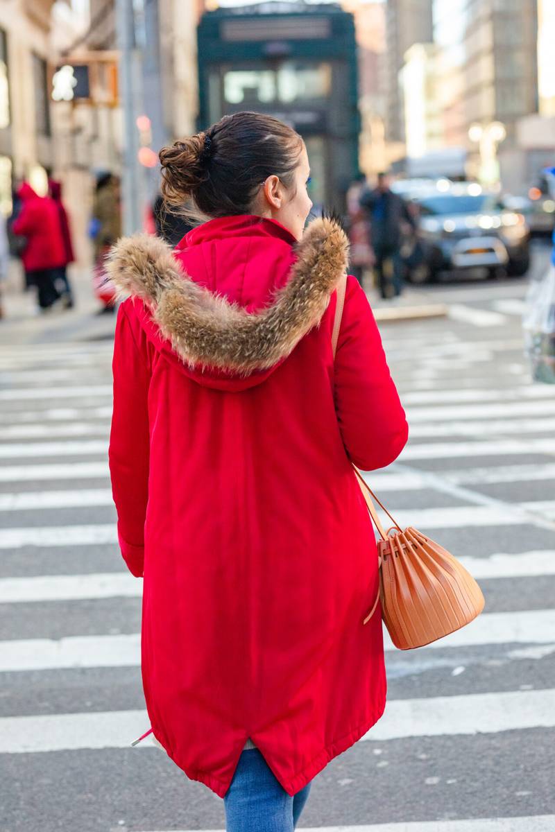
- A Cozy Cardigan (+/ Coat). To break up and balance the print-mixing further, I included a neutral element – a cardigan in a soft color. This cashmere duster is by Vince – and has comfy pockets and an open front, which makes it easy to wear in a variety of looks. My coat is by Maje and was a sample sale find; it’s great piece I’ve had for a few years now that looks fabulous over dresses and jeans alike.
I hope this inspires you to try out a similar look this Season to add some prints (and possibly mixed prints) to your wardrobe! Please feel free to share the outfits you create via Instagram, using hashtag #ModnitsaOutfit in your posts, and I’ll be sure repost them on my stories!
xo,

Photography by Leslie Moncada


No Comments
Sorry, the comment form is closed at this time.